Before we dig in, close your eyes for a second and think about a presentation or flyer that really stood out to you, good or bad. Maybe it looked amazing, or possibly it was an absolute struggle to read. Chances are, the font played a bigger role in that experience than you may have realized. Before an audience connects with the message, they are already reacting to the design.
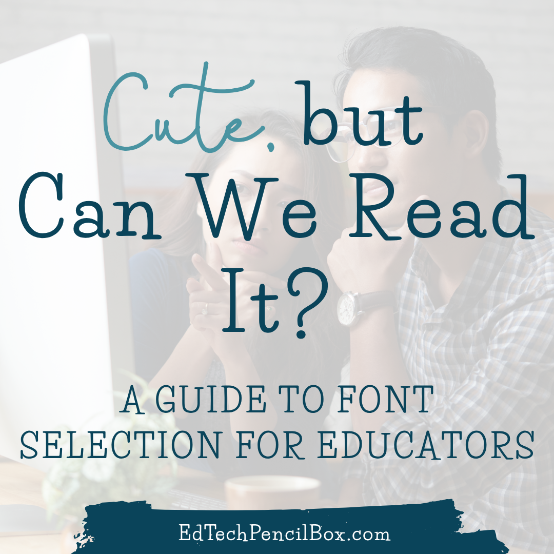
One of the quickest ways to improve a graphic, presentation, flyer, or classroom resource is also one of the most overlooked: font selection.
In my Introductory to Technology class, students recently completed an assignment where they customized a bulldog graphic including adding their name. It was creative, personal, and fun, but it also opened the door to an important media design conversation: just because a font looks cute does not mean it is easy to read.
And in education, readability matters.
Whether you are creating classroom slides, family flyers, social media graphics, conference presentations, newsletters, or digital resources, your audience should not have to work to read your message. Good design is not just about making something look polished or Pinterest-worthy. It is about making sure your message is clear, accessible, and easy to take in.
I am reminded of this anytime I am presenting at a conference. As I design the presentation template, I kept coming back to one simple design question: Can people read this easily from a distance? That one question can save us from a lot of design mistakes. A slide can be beautiful, branded, and full of personality, but if the audience has to squint, re-read, decode, or guess, the design is not doing its job.
Font choice matters more than people think
Fonts do more than decorate a design. They help shape how information is received. A good font choice can make your content feel clear, organized, and professional. A poor font choice can make the exact same content feel cluttered, confusing, or harder to trust. That may sound dramatic, but it is true. When we design for classrooms, schools, districts, or professional presentations, we are not just choosing what looks nice. We are choosing how easily people can access the message.
That is especially important for educators. We create materials for students, families, colleagues, administrators, and community members. We present in classrooms, meeting rooms, cafeterias, auditoriums, and conference spaces. We are often designing for quick understanding. If the font gets in the way, the message loses some of its power.
Did you know? Typographical design elements such as font type, character width, inter-letter spacing, and font size significantly impact reading speed and accuracy. Studies show that personalizing these digital design elements can enhance comprehension and reading speed by up to 20% to 35%, especially for struggling readers. [One Font Doesn’t Fit All study]
Pretty is fine. Readable is better.
Let’s be honest, most of us have seen a font and thought, Oh, that is adorable. Maybe it is swirly. Maybe it looks handwritten. Maybe it feels playful, trendy, or extra fancy.
And sometimes those fonts really can work.
But here is the catch: a font can be cute and still be a bad choice for communication.
Script fonts, decorative fonts, and novelty fonts can add personality, but they can also create readability problems fast. If the letters are too thin, too crowded, too detailed, or too unusual, readers have to put more effort into decoding the text. That is not what we want in a classroom, on a flyer, or in a presentation.
Good design should support the message, not compete with it…and don’t worry, there are ways of adding the fun while still being purposeful about the readability.
Start with readability, then layer in style
A smart starting point is to choose fonts that are known for being clean and readable. Sans serif fonts are often a strong option for slides and digital materials because they tend to read well on screens. Louisiana Tech’s University Communications typography guidance is a great real-world example of this. The university identifies Avenir/Avenir Next as its primary sans serif typeface and notes Lato as the preferred font for digital communication such as websites and emails.
That is a helpful reminder that font selection is not random in professional spaces. Universities, school districts, companies, and organizations often have brand fonts or preferred font families because typography is part of visual identity. Fonts help communication feel consistent, polished, and recognizable.
That is an important lesson for educators, too. When we learn to choose fonts intentionally, we are not just making better projects. We are building professional habits they will use in schools, districts, universities, and beyond.
As educators, you may want to select a branded font pairing that you use regularly maybe it could even include one of your districts fonts such as the main body font. If this feels too constraining, maybe you could think about having a font pairing per unit or study.
Templates are not cheating. They are training wheels for good design.
This is one of my favorite reminders for educators: starting with a template is smart.
Templates can help build your design eye. They often model strong font pairing, clear hierarchy, good spacing, and thoughtful alignment. Over time, using well-designed templates helps you start noticing what works:
- why one title stands out better than another,
- why some body text feels easier to scan,
- why one slide looks polished while another feels chaotic,
- and why spacing is doing more work than we sometimes realize.
So if you are just beginning to create graphics or presentations, start with templates. Borrow good design habits until they become your own. That is not taking the easy way out, that is learning with intention.
And honestly, in tools like Canva, where the font menu can feel like a scroll into chaos, templates can save a lot of time and questionable choices.
Script fonts can work, but they need a little extra love
I am not anti-script-font. Not even a little.
A script font can add personality, contrast, and just the right pop of sparkle when used intentionally. Check out the opening slide for my recent presentation at the National Field Experience Conference.
The script font works because it is used strategically and paired with a much more readable supporting font. Part of the strategy for this slide is only one word using the script font and a distinct color change. Additionally, I made adjustments to the letter spacing and thickness. The script font adds energy without trying to carry the whole design. That is the key.
If you want to use a script font, a few small adjustments can make a big difference:
- make it larger,
- use it for short phrases rather than full sentences,
- choose a version with thicker strokes if it feels too delicate,
- adjust the letter spacing,
- and make sure the color contrast is strong enough for the text to stand out.
Sometimes script fonts need more spacing. Sometimes they need less. Sometimes they need to be bolder. Sometimes they just need to be used in moderation. A little sparkle goes a long way.
The general rule: let the script font be the accent, not the entire outfit.
Color and readability go hand in hand
A good font choice can still fall flat if the color contrast is weak.
This is where design and accessibility meet in a really practical way. Light gray text on a white background may look soft and modern, but it is often much harder to read, especially from a distance or for people with visual challenges. The same is true for thin text placed on a busy image or low-contrast background. That is why font selection and color selection should always work together.
Tools like the WebAIM Contrast Checker make it easy to test whether your foreground and background colors have enough contrast for readable, accessible design. Accessible Web’s WCAG Color Contrast Checker is another helpful option and notes that WCAG AA calls for a contrast ratio of 4.5:1 for normal text and 3:1 for large text.
That is such an easy win. Before you download the flyer, post the graphic, or start the slideshow, take thirty seconds and check the contrast.
A few easy font fixes that make a big difference
You do not need to be a professional designer to make stronger design choices. A few simple habits can make your materials instantly more readable:
- Use no more than two or three fonts in one design.
- Choose readability over trendiness for body text.
- Use decorative or script fonts sparingly.
- Consider where the design will be seen. A projected slide needs to be readable from the back of the room.
- Adjust line spacing and letter spacing when needed.
- Avoid thin fonts on light backgrounds.
- Use templates to practice good hierarchy and pairing.
- Check contrast before you hit print, present, or publish.
Don’t forget, if you are creating for a school, district, university, or company, look to see whether there are brand guidelines for fonts and typography.
These are small shifts, but they make a big difference. For the custom bulldog assignment, we used Canva. If you are a Canva user, this video might also help with not only your font selection but organization within Canva.
Why this matters for future teachers
This is bigger than one bulldog assignment, but don’t worry, I will be sharing a few of their before and afters:)
When educators create materials, they are making design decisions that affect how students and families receive information. The fonts they choose influence whether directions are clear, whether key ideas stand out, and whether their materials feel polished and professional.
That is why I want my students (and educators in general) to move beyond asking, Does this look cute? and start asking, Does this communicate clearly? That is a design mindset worth building early.
A well-designed classroom slide helps students focus on the content. A readable flyer helps families quickly find the important details. A polished presentation helps an audience stay with the message instead of getting distracted by the design. These choices may feel small, but they add up.
And that is where the sparkle really happens, not when a design is overloaded, but when it is clear, intentional, and effective.
Classroom Takeaway
A cute font can absolutely have a place in your design, but not at the expense of clarity. As you create slides, flyers, graphics, and classroom materials, remember that good design helps your audience focus on the content, not struggle to decode it. Start with readable fonts, use templates to build your design eye, and always check size, spacing, and color contrast before you hit present or print. The goal is not just to make it look good. The goal is to make it easy to read, easy to follow, and effective for learning.
Final thought
Fonts do more than make a design look good. They help determine whether a message is actually received.
So yes, keep the cute. Keep the personality. Keep the creativity.
But make sure people can read it. Because in education, clarity is part of good design as it is directly connected to communication and comprehension of content!